What countries have the best flags?
What countries have the best flags?
. Mozambique 🇲🇿 . Angola 🇦🇴 . Albania 🇦🇱 . Antigua and Barbuda 🇦🇬 . Kiribati 🇰🇮 . North Macedonia 🇲🇰 . Uganda 🇺🇬 . Spain 🇪🇸 . South Africa 🇿🇦 . Portugal 🇵🇹 . Wales 🏴 . Greece 🇬🇷 . Uruguay 🇺🇾 . Britain 🇬🇧 . Panama 🇵🇦 . Dominican Republic 🇩🇴
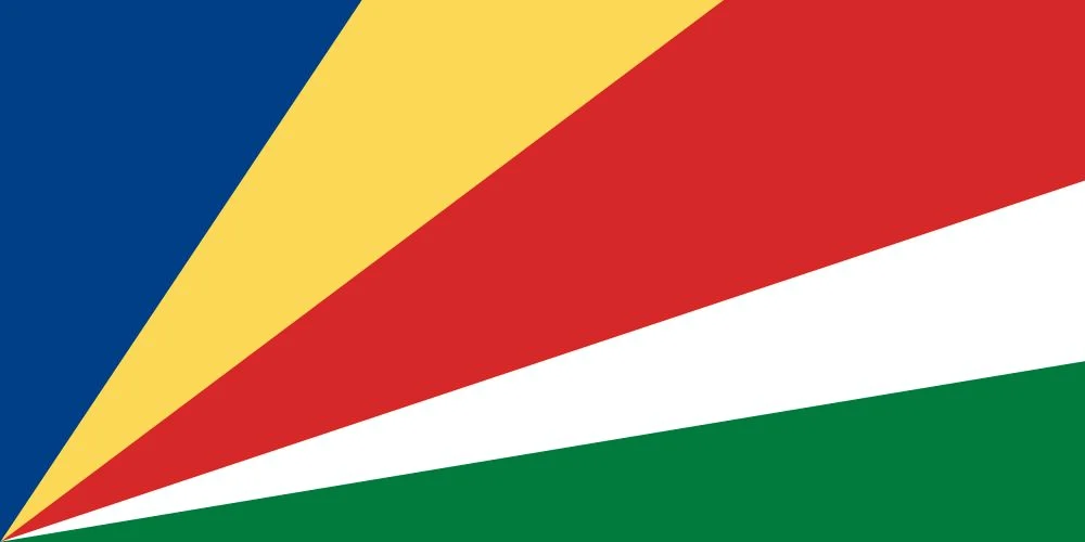
Sychelles:
Bhutan:

Bhutan would have had the best flag if someone colored it in.
it's cheating of you put a dragon.
where's buthan-Wales dragon alliance?
Seconding Seychelles, such a cool flag.
State flag, but: Maryland’s got an absolute banger, imo.

These uniforms go Hard AF

I was refraining from posting this, so I'm very glad someone else did. Back when we were masked up, I always appreciated the Maryland flag masks the most and made sure to compliment their wearers.
Agreed. It always makes me think of Nascar, lol. But the other half represents a pro-Confederate family, and I'd love to hear someone explain how the city of Baltimore has continued to accept that. "Bigger fish to fry" and "not wanting to alienate racists" is all I can come up with.
I think with a lot of stuff like that, most people don't care. Like I assume it's the red and white side that you're talking about but idk, and for sure I never see racists flying either set of colors which is why I think no one cares.
The Confederate flag didn't fall out of favor primarily due to its meaning in the 1800's, but moreso due to the contemporary associations.
The flag of the Chinook Nation is one I recall seeing and thinking it was very unique, memorable, and aesthetically pleasing.

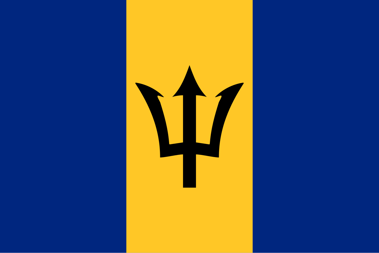
I also like the trident on the flag of Barbados.
Edit: fixed link
Vietnam:

Angola:

Nepal for originality:

I thought the Angola flag looked bad ass so I looked the country up on Wikipedia. This struck me as a bit odd.
"Angola achieved independence in 1975 as a one-party Republic, but the country descended into a devastating civil war the same year, between the ruling People's Movement for the Liberation of Angola (MPLA), backed by the Soviet Union and Cuba; the insurgent National Union for the Total Independence of Angola, an originally Maoist and later anti-communist group supported by the United States and South Africa"
The flag of Switzerland is always a plus.
Thinking outside the box: Nepal 🇳🇵
Nobody has mentioned Kyrgyzstan yet


Can anyone verify if Kyrgyztan is indeed, full of gamers?
The holy boule ball
Apologies in advance if I'm doing this wrong. But the 1890 national flag of China was badass. Check out the current Welsh flag though, I'd say it's close. 🏴
The Welsh flag was my favourite as a kid!
It kind of disappoints me that Wales ruins the standard:flag system in the Home Nations though, if they were to be included in the Union Flag I'd want to see it be the St. David's Cross with the dragon going on the Royal Standard where France used to be
just add the bloody dragon in the union jack. how hard can it be
-
Angola 🇦🇴
-
Albania 🇦🇱
-
Antigua and Barbuda 🇦🇬
-
Kiribati 🇰🇮
-
South Africa 🇿🇦
-
Portugal 🇵🇹
-
Wales 🏴
I agree these are good, the others were not though. I'd like to add to consideration:
-
Argentina 🇦🇷
-
Canada 🇨🇦
-
Japan 🇯🇵
In particular, Argentina is, if not the best national flag, at least my personal favorite.
. Argentina, bog standard three stripes and something in the middle design no different from El Salvador's, Guatemala and Honduras's.
. Canada, same as the Argentinian flag but worse because of its use of a leaf. By far the cringiest flag.
. Japan, it's just mid.
The Canadian flag is not a "bog standard three stripes" design. It even introduced a new vexillological term; the Canadian pale.
I don't understand why you think the maple leaf, a symbol which has been associated with Canada ever since there was a "Canada" to speak of, is "cringe".
The Canadian flag is a vexillological masterpiece and I will die on this hill. I wouldn't bother dying for my country, but I would for its flag. It's instantly recognizable, simple yet symbolic, and honestly such a massive glow-up from the previous Red Ensign flag.
You want to see a cringe flag? Look at this atrocity:
Click here if you don't care about your eyes

I agree that Argentina could be improved. Maybe make it five stripes instead of three? Just add a bar of white at the top and also the bottom. The red symbol in the middle is great, but maybe we need more than one, let's make it four in a horizontal row. Since there are more now they've got a be a little smaller and therefore also simpler, something recognizable but cool like a brewer's star.
Oops, just made the Chicago flag again. Unbeatable.
-
Someone else mentioned Seychelles, so I'll also throw in the rather awesome, Jamaica:

To my knowledge, Jamaica's is the only national flag to not contain red, white or blue.
Oh wow, that's cool. Didn't know that :-)
Flags of communist countries have always been awesome. USSR, China, North Korea, Vietnam, Cuba, Laos, East Germany
I can't find it, but there's a cool infographic / image that has all of them. I could only find one for the hammer and sickle variations:

I really like the ones that dared to be different and show what working class means to their area.
Nepal is my favourite. Most iconic hammer and sickle IMO
Flag of Iran, or the flag of the Kingdom of Hejaz (gone). Nothing political about those choices in particular, i just think their flags are the prettiest.


Iran flag is peak design.
really pushing the tricolour to new levels.
those stylised letters really give them a cool aesthetic. regardless of what's written. peak graphic design.
I always loved Angola. I also appreciate the minimalistic design of Japan.
Kazakhstan 🇰🇿
Very nice!
- borat
U mean design and style? If so then I like north macedonia
Which countries have the best flags in terms of flavour?
Japan, just a red dot
Despite its connotations the USA flag is pretty good.

Eh, honestly it's, like, functional (you can recognize it and draw a facsimile of it in 3 minutes with two pens). I wouldn't call "it pretty good".
Must be the Dutch one since half the world copied it in some way 🇺🇸 🇮🇩 🇷🇺 🇫🇷
Wales no doubt.
The colors are great there, it works surprisingly well.
🇧🇷
Vanuatu 🇻🇺
It's got a boar's tusk on it.
I quite like the flag of Tanzania

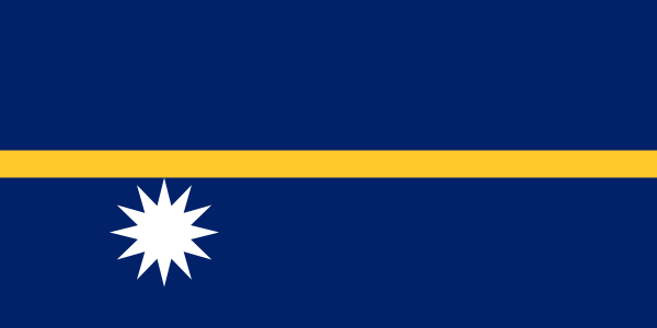
And also Nauru, which is really helpful of you want to remember which hemisphere Nauru is (just barely) located on
I've always liked Libya's old one. Real green flag.
this one 🏳️⚧️
Curious flag, looks like a cream-filled candy cross section
I like Canada 🇨🇦, Wales 🏴 and Bhutan 🇧🇹