What is the best looking retro console or PC?
What is the best looking retro console or PC?
I'd have to go with the wood grain Atari 2600, I'm a sucker for 70's designed electronics.
The 2600 depicted in the article thumbnail, was absolutely a beauty in its native environment of the late 1970's:
While I definitely agree the overall best design goes to the Atari 2600, this comes in close second for me:
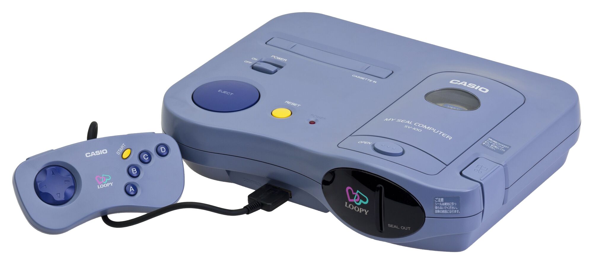
This bad boy (or girl, rather) is the Casio Loopy. Yes, Casio, the company primarily known for making wristwatches. This console was only released in Japan, and when it launched it had a target demographic of girls and young women. The console came with a built-in sticker printer, and the games were woman-targeted games in genres like romance, fashion, and life simulation (like Animal Crossing). Only 10 games were ever made for the Loopy, by the way. Its biggest failure and reason for not selling well was being a console that had games that looked like the SNES but having to directly compete with the PS1 and N64, as well as the replaceable sticker cartridges being very expensive.
Now, I am a man, and I am clearly not a part of the target demographic of this console. The games are entirely uninteresting to me, except maybe the Animal Crossing-like game "I Want A Room In Loopy Town." But something about the curved shape of the console and its cool purple hue speak to me. The black cover for the sticker ejection port has me imagining a newer version playing an animated logo on that part if a small screen was behind it. The absurdly massive Eject button just looks like it gives the most satisfying "kerchunk" when you press it to eject a cartridge.
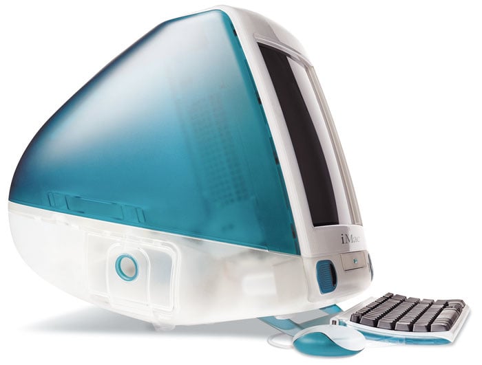
In third place I'd have to give a shout out to the Apple iMac G3, even though I really dislike Apple products and its neither a game console.or made for gaming in general, something about the white and bold color combo just looks really cool. The mouse was really bad though. Got a bit of that Frutiger Aero look.
Japan had some killer PC designs in the 80's and 90's. But I'd say my favorite is a toss up between the X68000 and the Sony MSX 2
For consoles, I still think the Sega Genesis Model 1 is a masterclass in visual design.

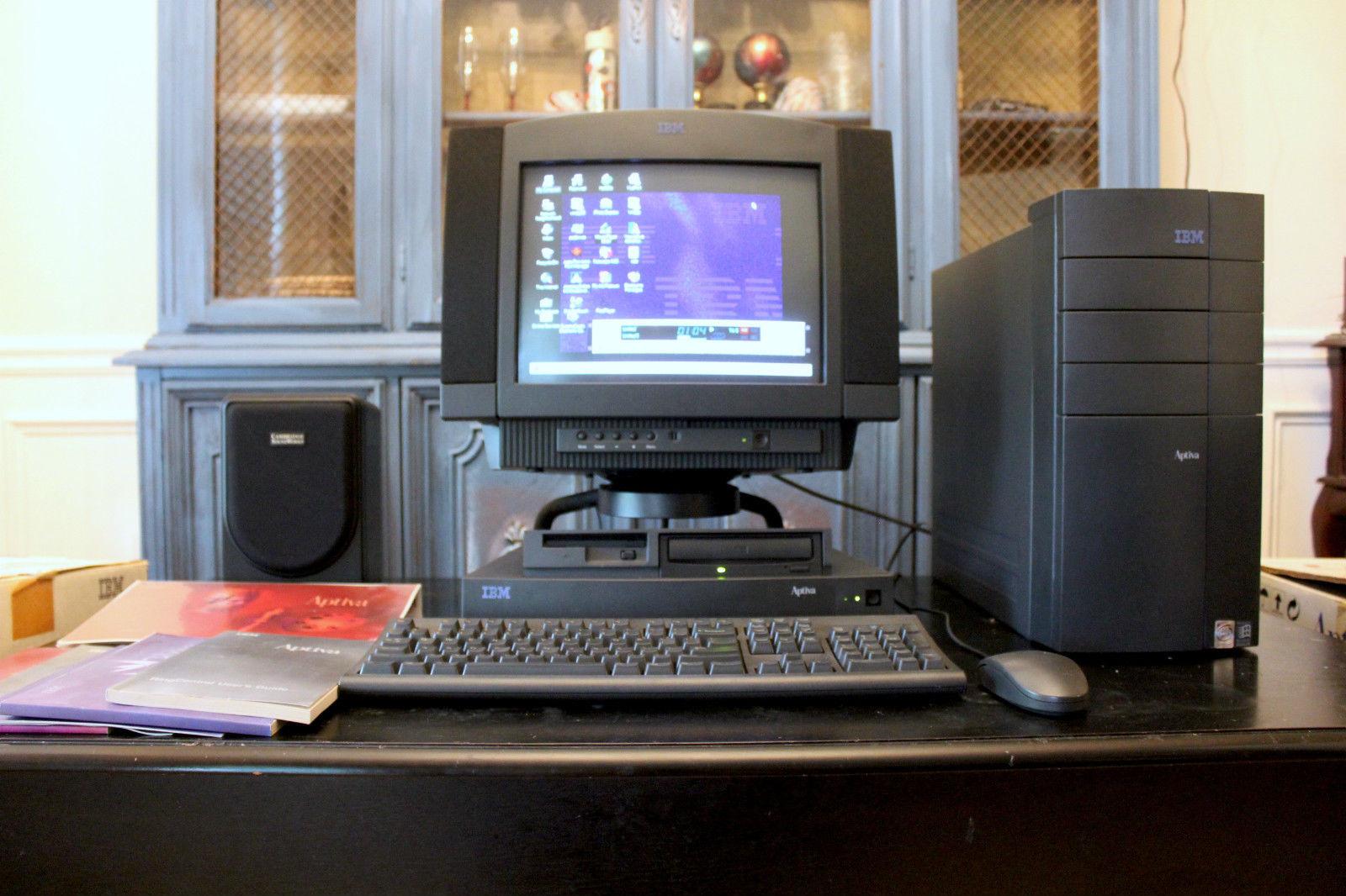
I got my start with atari 2600 but I think the GameCube was the best looking in both form and function. Best looking computer is an IBM Aptiva S
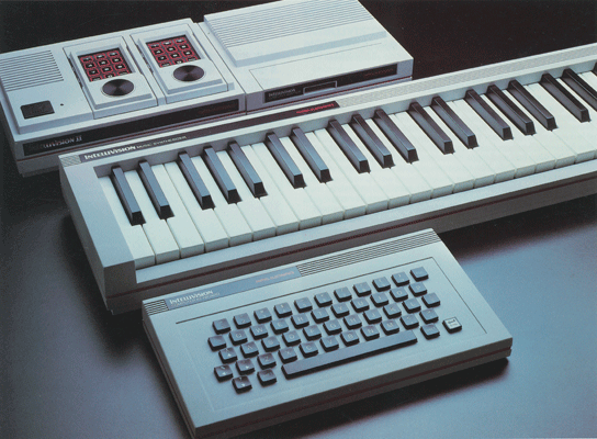
Why does there have to be just one? So many consoles are awesomely designed and reflect their eras well. I’m partial to colecovision and the Intellivision II. The redesign of the intellivision had an entire suite of peripherals to match the new design, including a musical keyboard.

(I'm sad no one uses faux-marble anymore.)
Although the wood-grain Atari 2600 was also my first thought upon reading the title, I think the Wii's minimal footprint is impressive considering that—in the case of the original model—it's also a GameCube.

In contrast to the Wii's 2006 release, the Wii Mini is arguably not yet 'retro' with its 2012 release, but definitely looks a lot sleeker, albeit not worth the loss of GameCube functionality for its minimal size savings.
Compared to both, the Wii U is super bulky, and lacks much use beyond improved emulation capabilities now that nearly all of its exclusives have been re-released for the Switch.
I've got to go with the 2600 as well. Mostly because of the wood grain!
I had this one many moons ago. https://en.m.wikipedia.org/wiki/Coleco_Telstar_Arcade#/media/File:Coleco-Telstar-Arcade-Pongside-L.jpg
Wood grain, triangular, and it had a gun.
The Atari XL seriea computers cut a nice space between retro and futuristic.
They're much sleeker looking than their 400/800 predecessors, as well as the Apple II and the breadbin VIC 20/64/C16. Only the 64C and Plus/4 really look similarly minaturized and not-in-need-of-a-big-wristrest-for-comfortable-typing.
The use of metal and smoked plastic trim gives it a premium appearance. The 1200XL even hides the cartridge slot on the side to avoid anyone nistaking it for a mere console..
If we're talking strictly design, my personal favorite is a generic fat PS2, probably tied with my model 1(?) Sega Genesis (none of the things like 32x or CD, which I desperately want to get some day).
If we're talking like PC with OS, the 90s Amiga lineup because I think the Amiga Workbench 3 line and the icons they used look absolutely beautiful. Definitely would love to get my hands on a 1200, but they're expensive. So no getting into that hobby for me just yet.
the atari 2600 looks like it could take you back to the future with enough jigawatts
Dreamcast and the first Playstation.
For pure old school retro it would be the old Compaq suitcase-sized laptop PC.
It just looks so sleek. For me, it was the future of gaming.
I would choose the Super Famicom. It just looks so sleek. I don't know why they changed it with the SNES, it looks ugly.
NGL, that fine-wood version of the Atari looked so slick. Too bad I only got the cheap plastic one.
PlayStation is one of my favourites but it also comes down to that shade of grey being my absolute favourite shade of grey. And the OG pre-dualshock/analog potentially being my favourite shape of controller too. I have a modded Bluetooth one but sadly there's not too many modern games (outside of fighters) that don't need both the dpad and analog.
I also love the Gameboy color's shape. As an adult it's great for one handed gaming for rpgs.
One more vote with OP. That Atari is a nice looking machine.
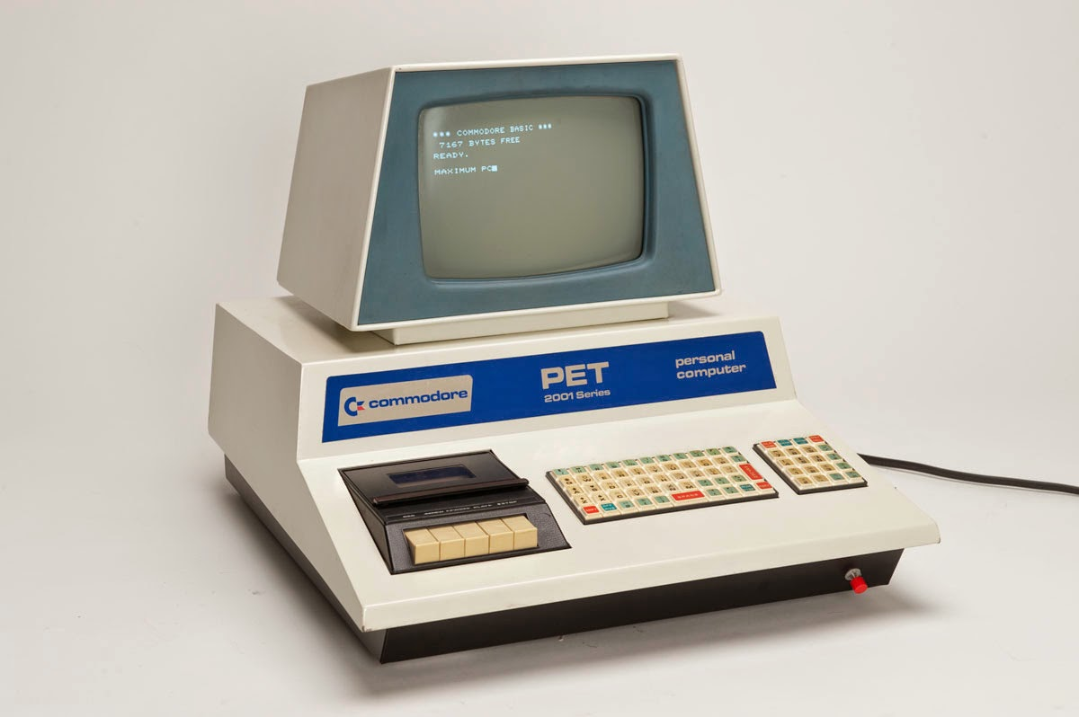
Technically neither a console nor a PC (in the IBM-compatible sense), but the Commodore PET has a certain kind of 70s futurism about it.
Note the integrated tape deck for all your storage needs.
The keyboard pictured, while interesting looking, is a complete POS. Later PETs had a more usable keyboard with a better layout.
Edit: I don't think that red button at the bottom right is stock. It's almost certainly a hardware reset button, which on the Commodore machines is typically done by shorting a couple pins on a user expansion port.
The Atari Portfolio (the one John Connors uses in Terminator 2) or the ST Book.
Console: Sega Dreamcast
PC: Any IBM beige box from the 90s
I like the woodgrain look, but I don't think the Atari 2600 is a very good example of it. Lots of audio equipment from the time does it better. Especially when combined with brushed aluminum or stainless steel.
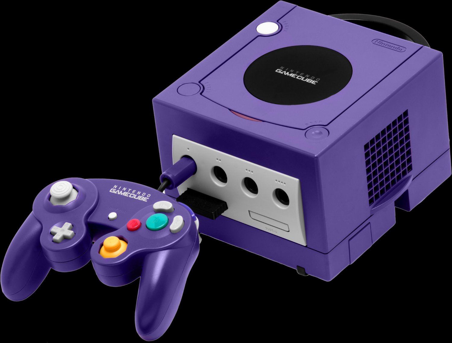
Purple GameCubes are retro now, so I'll go with that as my favorite.
Damn, wood. Or wood-looking material at least.


