The Death of Industrial Design and the Era of Dull Electronics
The Death of Industrial Design and the Era of Dull Electronics

The Death Of Industrial Design And The Era Of Dull Electronics

It’s often said that what’s inside matters more than one’s looks, but it’s hard to argue that a product’s looks and its physical user experience are what makes it instantly recognizable. When you think of something like a Walkman, an iPod music player, a desktop computer, a car or a TV, the first thing that comes to mind is the way that it looks along with its user interface. This is the domain of industrial design, where circuit boards, mechanisms, displays and buttons are put into a shell that ultimately defines what users see and experience.
Thus industrial design is perhaps the most important aspect of product development as far as the user is concerned, right along with the feature list. It’s also no secret that marketing departments love to lean into the styling and ergonomics of a product. In light of this it is very disconcerting that the past years industrial design for consumer electronics in particular seems to have wilted and is now practically on the verge of death.
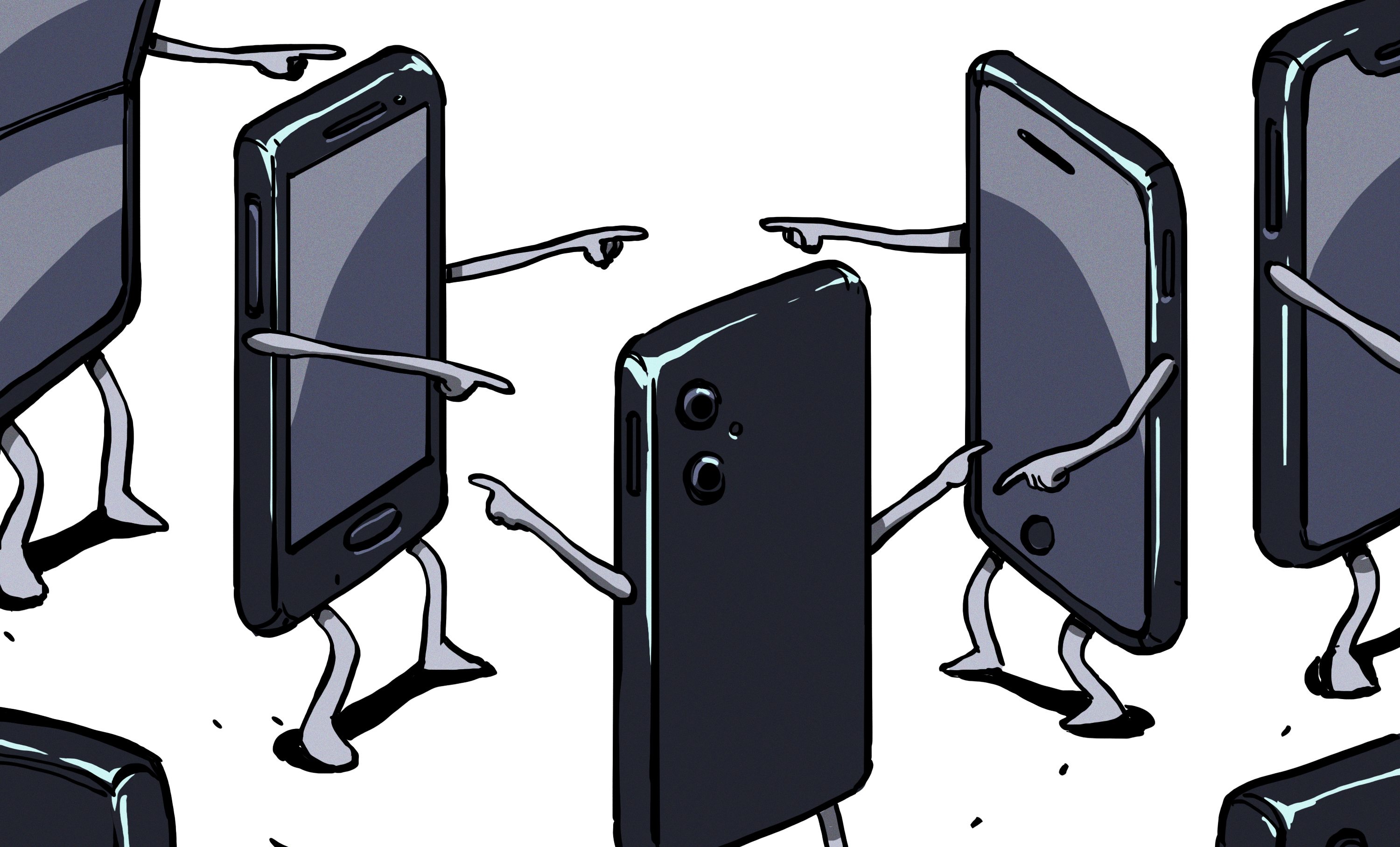
Devices like cellphones and TVs are now mostly flat plastic-and-glass rectangles with no distinguishing features. Laptops and PCs are identified either by being flat, small, having RGB lighting, or a combination of these. At the same time buttons and other physical user interface elements are vanishing along with prominent styling, leaving us in a world of basic geometric shapes and flat, evenly colored surfaces. Exactly how did we get to this point, and what does this mean for our own hardware projects?
Bold And Colorful Shapes
Motorola RAZR V3i mobile phone from 2005. (Source: Wikimedia)
Industrial design is less of a science and more of an art, limited only by the available materials, the constraints of the product’s internals and the goal of creating a positive user experience. Although design has always played a role with many products over the millennia, these were generally quite limited due to material and tooling constraints. As both plastics and electronics began their stratospheric rise during the 20th century, suddenly it felt like many of these constraints had been removed.
No longer was one limited to basic materials like stone, metal, wood and paint, while internals got ever smaller and more flexible in terms of placement. Enclosures now could take on any shape, while buttons, knobs and dials could be shaped and placed to one’s heart’s content. This change is clearly visible in consumer devices, with the sixties and subsequent decades seeing a veritable explosion in stylish transistorized radios, home computers and portable entertainment devices, with industrial designers getting the hang of all these new materials and options.
The peak here was arguably achieved during the 1990s and early 2000s, as electronic miniaturization and manufacturing chops led to device manufacturers basically just showing off. Personal Hi-Fi systems and portable devices along with computer systems and laptops grew curved, translucent and transparent plastic along with a dazzling array of colors.
These days we refer to this era as the ‘Y2K Aesthetic‘, which was followed around the mid-2000s to early 2010s by the sweetly named ‘Frutiger Aero‘ era. During this time both hardware and software underwent a transition from mostly utilitarian looks into something that can be defined as tasteful to over the top, depending on your perspective, but above all it embraced the technologies and materials in its industrial design. Futurism and literal transparency were the rule, as a comfortable, colorful and stylish companion in daily life.
From Brick To Slab
Mobile phone evolution from 1992 to 2014, starting with the Motorola 8900X-2 to the iPhone 6 Plus. (Credit: Jojhnjoy, Wikimedia)
Ask someone to visualize a Nokia 3310 and even if they’re born after 2000, there’s a good chance that they will be able to tell you what it is, what it does and what it looks like. Then ask that same person to describe any modern cellphone, and while the feature list should be quite easy, asking them to draw what differentiates, say, an iPhone 16 from a Samsung Galaxy S25 is effectively impossible unless they have memorized the layout of the cameras on the back and perhaps the side button placement.
The iPhone 12 through iPhone 15 Plus. Marketing would like you to find the differences. (Source: Wikipedia) Samsung Galaxy S23, S23+, S23 Ultra. (Source: Wikimedia)
Over the decades, cellphones have seen their displays grow larger and larger. With voracious appetite, these displays have consumed bezels, front speakers, keyboards and home buttons.
Along with the demise of these features, front facing cameras were only preserved by literally punching a hole in the display, but notification LEDs vanished right along with headphone jacks, IR blaster LEDs, swappable covers, removable batteries, etc.
The current scuttlebutt is that Apple will be the first to drop any and all connectors from its iPhone cellphones, with the iPhone 17 reportedly nearly becoming the first to do so. Along with eSIMs, this would leave smartphones as glued-together slabs of plastic-and-glass with only a screen, some cameras and a couple of buttons.
In marketing shots smartphones are always shown with a lock- or home screen open on the screen, because otherwise there would be just a lifeless black slab of glass to look at from the front. From the side you can see the same slab, which easily wobbles on its ever-growing camera hump that’s sticking out of the razor-thin case like a bad case of optical melanoma. At this point in time, the most exciting thing about cellphones is whether it can flip or not, followed by whatever subdued color is applied to the slippery glass back that you want to cover up with something concealing and grippy as soon as possible anyway.
Naturally, it’s not just phones either, but also computers, with the iMac’s evolution showing a clear ‘evolution’ from colorful and bold designs to geometric slabs:
Evolution of the Apple iMac. (Credit: Wikimedia)
Whether you call it ‘modern’ or ‘clean’ design, the trend is quite clear. Curves are removed, colors are purged or at the very least muted and the overall design reduced to the level of excitement experienced while being stuck at an Ikea showroom during a busy weekend with the family.
Lifeless Slabs
An LG Flatron CRT TV from around 2007. (Credit: Briho, Wikimedia)
There was a time when televisions had a recognizable look to them, with a stylish bezel, a real power button, as well as a couple of front input connectors and buttons to adjust basic settings like volume and the current channel, which could also be hidden behind a small flap. This is now all gone, and TVs have become as visually striking from the front as modern smartphones, with the speakers fully nerfed since there’s no space on the front any more.
All inputs and any remaining controls are now hidden on the back where reaching them is borderline impossible after installation, never mind if you mounted it on a wall. You’re not supposed to find the TV visually appealing, or marvel at the easy user interface, just consume whatever content is displayed on the bezel-less screen.
The rest of any home entertainment setup has undergone the same process, with the HiFi stacks and mid-sized sets of yesteryear replaced by the same smartphones and TVs, along with a bit of plastic that you can stick into a slab TV to stream content with from some internet-based service.
An Apple HomePod and HomePod Mini mono speakers.
Rather than a stereo – or better – HiFi setup, most people will have a bunch of usually mono Bluetooth speakers scattered around, each of which possessing the visual appeal of a radar dome. If you’re lucky there are still a couple of touch buttons to fondle, but virtually all of your interactions with such devices will go via an app on your slab phone.
Touch controls are also all that you will get these days, as physical buttons, dials, sliders and switches are almost completely faux pas in modern-day product design. Everything has to be smooth, stealthy, invisibly present and yet always there when you crave that entertainment fix.
This design language isn’t just afflicting home electronics either, as over the past years car interiors have seen physical user controls vanish in favor of one or more touch screens, with cars like those from Tesla being the most extreme example with just a single large touch screen on the center console as the sole user interface. Users are however pushing back against this change, with a number of studies also showing that touch-only controls are less effective and less safe than fumbling around on a big screen while driving to adjust something like the climate controls or radio station.
There Is An App For That
Want to set up your new formless slab of plastic or fabric? Please download this special mobile app to do anything with it. Got a new pair of headphones? Better pray that the mobile app works well on your slab phone or you’ll be stuck with whatever preset defaults it came with, as physical controls on the device are for dummies.
Whether we like it or not, the human user interface part of industrial design has been mostly taken out back and replaced with software running on a slab phone. Whatever vestigial controls still remain on the device itself will only be a small subset of what its electronics and firmware are capable of. The slab phone has thus become the user interface, with that part of industrial design often outsourced to some third-party mobile app developer.
This has massively backfired for some companies already, with Sonos in 2024 releasing a ‘new and improved’ version of its slab phone app that was so buggy and plagued with issues that it rendered the Sonos speaker hardware effectively useless. While physical user interfaces have their issues, sinking an entire company due to a badly arranged set of knobs is not as easy as with a slab phone app or equivalent, not to mention the potential to retroactively brick the user interface of devices that people have already purchased.
Yearning For That Human Touch
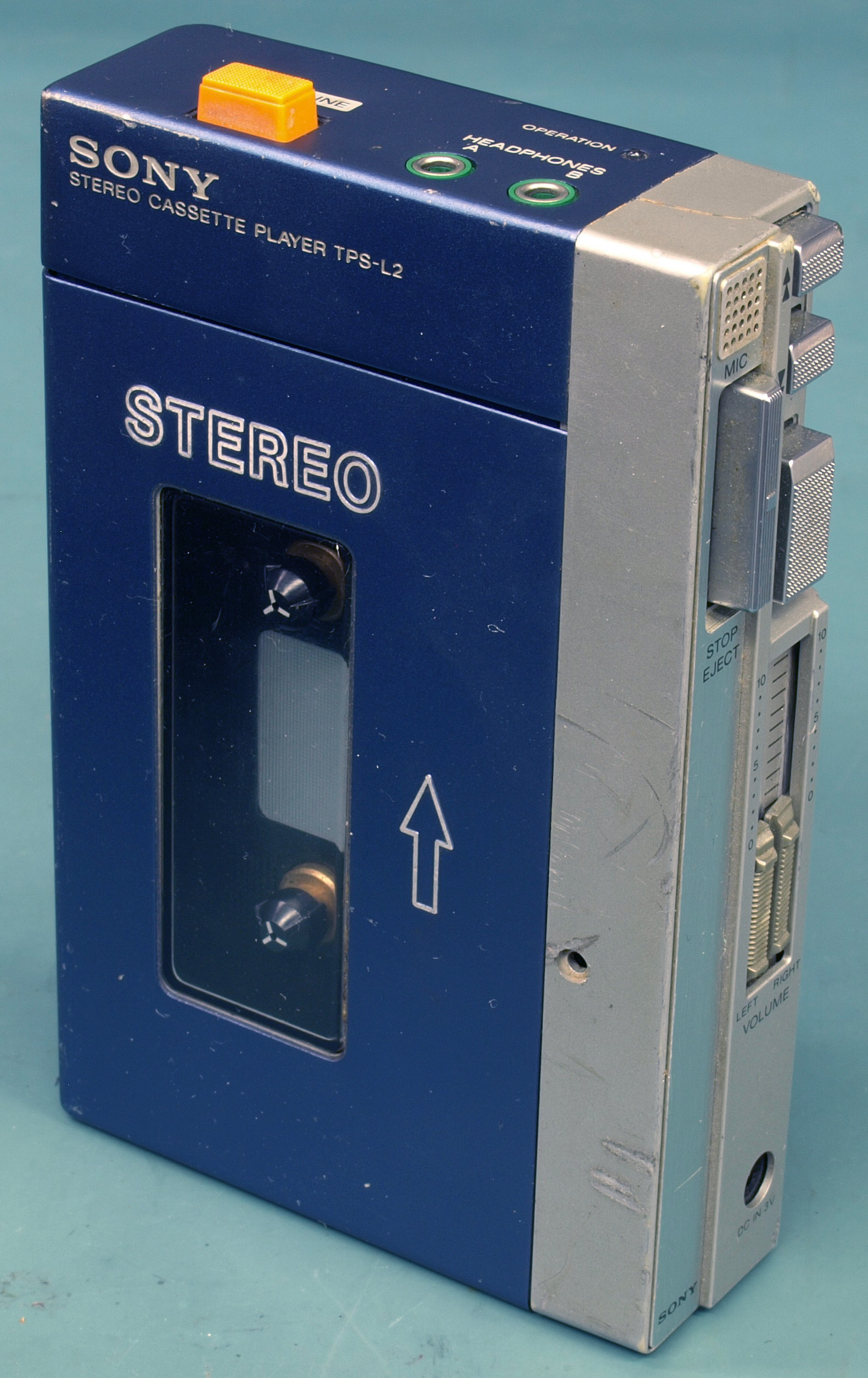
Original Sony Walkman TPS-L2 from 1979.
Here we can see parallels with computer user interfaces, where much like with industrial design there’s a big push to reduce shapes to the most basic geometric forms, remove or reduce color and remove any ‘superfluous’ styling including skeuomorphism. These parallels are perhaps not that surprising, as companies like Google, Apple and Microsoft produce both consumer hardware and software.
Google, for example, has heavily invested in its Material Design design language, which can be summarized as having flat color backgrounds with the most simplistic UI elements suspended in said void. UI elements like the ‘hamburger’ icon are used to hide menus not just on phones, but also on desktop systems, where a form of extreme minimalism is being pushed to its ultimate extremes.
In the case of consumer electronics that means devices that lack any distinguishable features, as minimalism is a poor way to distinguish one product from another. The removal of visually pleasing and physically practical elements also means a dull, stimulation-free experience.
There are no pleasing elements to rest your eyes on, no curves or colors that invoke an emotional response, no buttons to press, or any kind of auditory or physical response. Just lifeless touch controls on slabs of plastic and glass with maybe a sad beep as confirmation of a touch control having been triggered.
In this context, what is often called the revival of physical media can be interpreted as not just a yearning for a more visceral audio-visual experience, but would together with so-called retro-computing be a way to experience personal electronics in a way that stimulates and invigorates. Where physical buttons are pressed, sliders slid, dials turned and things go click and whirr as one’s fingers touch and manipulate the very real user interface elements.
We know that chronic boredom can be extremely harmful to non-human animals, with enrichment toys and activities prescribed to make them happier and more content. With modern day consumer electronics having become incredibly dull due to the death of industrial design, it would seem that us human mammals are seeking out our own enrichment activities, modern design sensibilities be damned. If this means repeating the sins of early 2000s or 1990s industrial design in our personal hobbyist projects, it’s a price worth to pay for keeping ourselves and our fellow humans happy and enriched.
From Blog – Hackaday via this RSS feed
