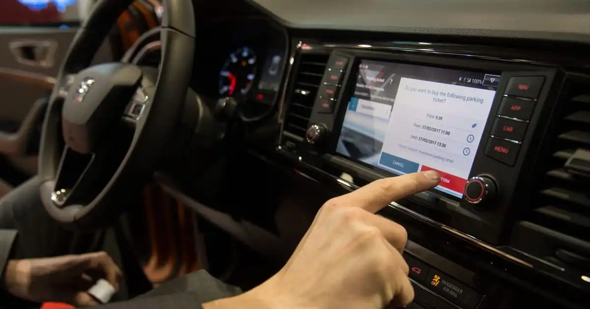
European car safety body is coming for touchscreens. The European New Car Assessment Programme mandates that key controls need physical buttons or switches
The European New Car Assessment Programme mandates that key controls need physical buttons or switches.
Carmakers are equipping their latest models with fancy touchscreens, but that could cause problems with Europe’s largest car safety authority.
The European New Car Assessment Programme (NCAP) is revamping its rating system starting Jan. 1, 2026 to mandate that five of a car's primary controls — its horn, windshield wipers, turn signals, hazard warning lights and SOS features — will need physical buttons or switches.
Car models will have to comply to get NCAP's coveted five-star rating. The scheme is voluntary but is heeded by most automakers because it's closely monitored by consumers.
Belgium-based NCAP says that purely digital controls are a potential safety issue.
to mandate that five of a car's primary controls — its horn, windshield wipers, turn signals, hazard warning lights and SOS features — will need physical buttons or switches.
Good, but would be great if climate control, volume/mute, and other things that need frequent adjustment while driving were also part of the mandate.
Car models will have to comply to get NCAP’s coveted five-star rating. The scheme is voluntary but is heeded by most automakers because it’s closely monitored by consumers.
Bollocks. F*ck this shit. Make it mandatory and take those ticking time bombs of the road. They are endangering OTHER people's lives. Voluntary my ass.
I love some EVs, but I drove a Polestar 2 and a Model 3 on road trips for work in California. Never again. The nighttime driving experience is miserable imo, and the issues with the lack of stalks and buttons is real.
The Polestar is the only car to ever make me so angry I had to pull over. It had some kind of sensor issue, and decided the right way to notify my at 80mph on the highway was to A) cover my gate cluster with the error notification B) disengage my cruise control suddenly, at 80mph, and C) begin beeping.
I almost drove my rental into the Pacific Ocean out of spite.
Good, there's no reason for there to be more information displayed than you can read at a glance. And you should be able to feel for the controls you need instead of having to look at the screen and flip through menus.
Got very happy seeing the title, but we’re just talking about the bare minimum like horns and windshield wipers. A tiny step in the right direction, but not much else
I think they need to be super explicit to stop the likes of Tesla weaseling out or doing the bare minimum:
Wipers, speed settings, auto on/off should be on a stalk for front and rear wipers
Indicators should be on a stalk with
Hazard lights must be a physical button
Horn may be on the wheel or a button
Lights on/off/full beam/dip/auto must be a dial or a stalk
Demister / heated window must be physical buttons
Gears must be a physical rocker, lever or dial
And button / dial etc here means an actual push up/down button not some haptic / touch sensitive shit.
Because at the moment Tesla are basically cheaping out of providing physical controls to save money. It doesn't matter if someone crashes their car fiddling to set the wiper speed because Tesla saved $20 on a stalk and that's all that matters.
mandate that five of a car’s primary controls — its horn, windshield wipers, turn signals, hazard warning lights and SOS features — will need physical buttons or switches.
Would love to see cruise control added to that list.
Belgium-based NCAP says that purely digital controls are a potential safety issue. "What we now see is we have more and more ... crashes where people are having collisions because they're being distracted," said Matthew Avery, NCAP's director of strategic development. That matters because fatal car accidents are on the rise in the EU. More than 20,000 people died on the roads in 2022, a 4 percent increase over 2021. The bloc wants to halve the number of road deaths by 2030, with the goal of zero fatalities by 2050. Moreover, if the displays don't have tactile feedback, drivers can be distracted by having to poke at the screen — unsure if the controls are registering. "The problem with touchscreens is that there is inherently a lag in them, and more importantly, there is no haptic feedback," car interiors become increasingly high-tech, the different systems are starting to diverge. Gone are the days of getting into a car and immediately knowing where all the controls are; nowadays drivers have to adjust to each new car. the illumination from the screen diminishes the ability to see down dark road[s] because pupils normally adjust when [cars] have more light inside and [the] instrument panel and touchscreen causes an additional amount of light in the car, therefore diminishing nighttime vision," Carmakers like Tesla which rely heavily on new tech will have to decide if NCAP's five-star rating is worth reversing its interior design
Side note: touch screen are a gimmick not a new technology. the scale you have at the mall has a touch screen and has had one since the 90's. These touch screens are used in specific locations and settings to manage complex ui, with a lower maintenance cost and the chance to keep a device running for longer with a simple os update. Most touchscreen are, believe it or not, still resistive, as they have a strong feedback and they work across most temperature ranges. Most touchscreens are added to static tools like lab tools or workstations like lifts, scales, and so on. At no point they added resistive touchscreen in cars when the tech was new. Wanna know why? Touchscreens suck. Than the Iphone came and brought us here. Now we think that touchscreens are futuristic and fancy. Not, they aren't. Star wars and even Star trek had all physical control with full sets of buttons for the management of the ship. If a starship that you always liked had physical buttons why shouldn't your car have that design?
I don't understand the touch screens in cars, I would expect them to be more expensive than physical buttons. Are there that many people who think it's fancy that it's a selling feature?
Wow, have any car manufacturers actually tried changing these functions to touch buttons? I know Tesla got rid of the stalks, but my understanding was they still had physical buttons on the wheel to replace them.
I only have a touch screen for entertainment and configuration and still notice how distracted I get when I have to use it. No haptic feedback and multilayered menus are just a bad idea while driving.
Cherry in top is driving at night with astigmatism when theres's a whole illuminated panel in your face.
That's actually a good idea, because when your finger is wet the touchscreen doesn't work and on touchscreen is more difficult to develop muscle memory, so you spend more time distracted trying to find the spot on screen to touch
This requirements should apply too AT THE VERY LEAST to air conditioning. I hate new models that require you to interact with a screen to turn it on, or to operate the infotainment volume.
i haven’t driven in a while but i can’t remember really needing to control my keys that much. usually they stay put pretty well once they’re in the ignition
If they were truly focused on safety, they would have all commonly adjusted features able to be adjusted without having to take your eyes off the road. I have a 2020 Nissan versa and the only time I look at the screen is to press pause/play and to check who's calling. Everything else I can do by feel.
This is the perfect example of, just because you can doesn’t mean you should. Physical buttons are always more reliable without having to take your eyes off the road.