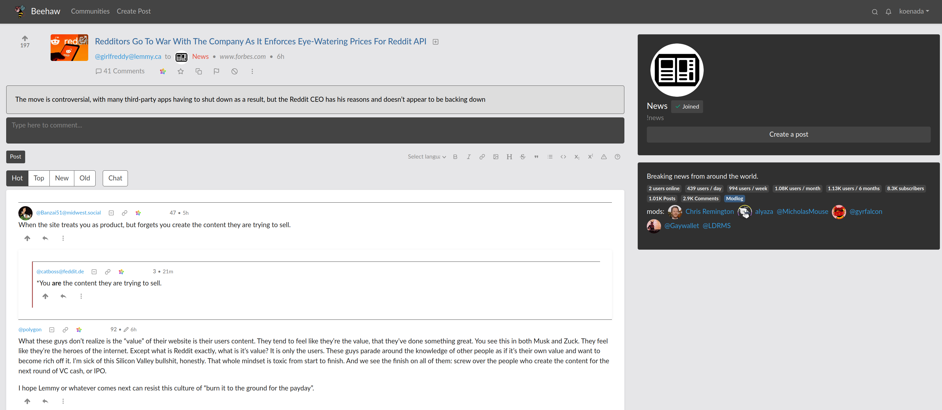
I've started using beehaw a bit more and found the UI was a bit small. I had 2 main goals, outside mimicking a Reddit theme I used to use:
- Make things a bit easier to read - So much small text everywhere. Maybe I'm just getting old.
- Use more of the horizontal space
Some screenshots:
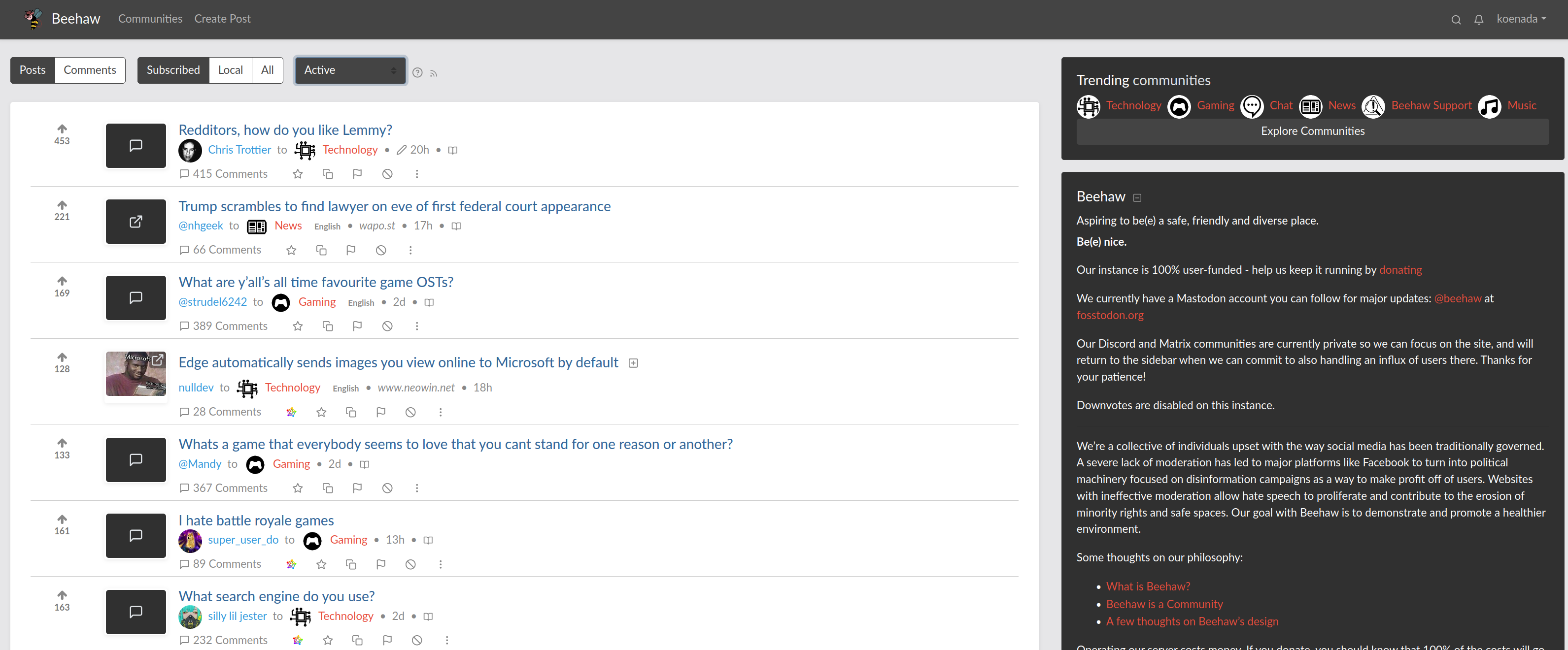
It does have some issues:
- Only tested on 1 resolution/size so who knows how it looks elsewhere
- I mostly only looked at the main page and posts. It doesn't look quite right in the user settings, profile, comminties, etc.
- Only tested with the darkly-red theme
- I didn't bother messing with the footers or side bars
- There's no light/dark theming
I'm not really a web developer so most of my knowledge is from before web devs started using web frameworks, like bootstrap, so this is probably a bit hacky. I'm not positive I'll continue with the theme but thought it could be interesting for someone else.
The CSS (I'm using Stylus):
``` @-moz-document domain("beehaw.org") { body { background-color: #e6e6e8; color: #fff; }
div.container-lg { max-width: unset; }
div#app > .navbar { background-color: #444; }
h5.mb-0 { color: #000; }
.mb-4 { background-color: #000; }
.mb-3 .btn-outline-secondary { color: #444; background-color: #fff; }
div.main-content-wrapper div div:not([class]), /* Main Page */ div.comments { background: #fff; border-radius: 4px; box-shadow: 0px 1px 5px rgba(0, 0, 0, 0.08); padding: 2%; }
div.text-muted { color: #777 !important; } ul.small { font-size: 1em; }
div.vote-bar.small { font-size: 1em; }
/* Thread Preview */ div.post-listing .pr-0 { max-width: 100px !important; }
/* Thread Text */ div.post-listing .card { background: #ddd; color: #000; }
div.post-listing .card-body .small { font-size: 1em !important; } div.post-listing .card-body .text-muted { color: #000 !important; }
div.post-title a { color: #369 !important; line-height: 1; }
div.post-title h5 { margin-bottom: 0 !important; }
/* Thread Seperator */ hr.my-3 { border-top: 1px solid rgba(0, 0, 0, .2); margin-top: 0 !important; }
/* Comment Related / div.comments .comment:not([class="mark"]) { background: #fff; color: rgb(34, 34, 34); } div.comments div[class*="mark"] { background: #ddd; color: rgb(34, 34, 34); }
div.comments .text-muted { color: #000 !important; font-size: 0.9em; }
/* Move the votes and time closer */ div.comments .mr-lg-5 { margin-right: 0 !important; } div.comments .mx-2 { margin-left: 0 !important; } } ```
Yeah, I think that a helps a bit but if it requires actually opening the thread, then it's only a mild improvement. I'd really prefer mark as read or hide without opening the thread (there's a lot of threads I have no interest in reading but are hanging around the front page).
I appreciate the suggestion though. It does help a little.
I think the lack of hiding of previously viewed posts is one of my biggest gripes. I used to use Hide a lot in Reddit but all the alternatives are missing it.
A few other issues I have:
- the need to click into threads to open a link is annoying
- the inability to open comments and links in separate tabs/windows
- lack of flair - /r/nfl flair were really nice, for example