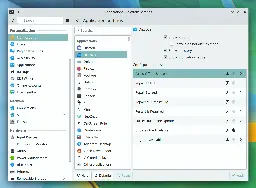
Excellent progress was made this week towards the goal of full sound theme support in Plasma 6, among other topics–including some important performance work for KWin! Plasma 6 General info &#…
Excellent progress was made this week towards the goal of full sound theme support in Plasma 6, among other topics–including some important performance work for KWin!
I want to see KDE focus on its UX a bit more and break a bit of harmful backwards compatibility. Having multiple rows in the window header like the combination of a title bar a menu bar and an action bar that makes their combination tall AF, having a thousand disjointed panes, apps being completely rigid and non-responsive and using dated customisation options that only lead to inconsistent and ugly results when tampered with, and rejection of design paradigms that get praised and adopted by everyone like headerbars, all in the name of old theming technologies that depend on practically technical debt, like X11. KDE needs to adopt a vision that looks towards the future, not the past. Until then, I'll stay in GNOME.
Many of us don't praise or want titlebars controlled by apps individually, and there are more reasons to keep them separate than just backward compatibility, FWIW.
But if you haven't checked it out lately, you may want to look at the MauiKit/Nitrux stuff.
I wouldn't use Plasma if I didn't have the option to turn on menus. The hamburger menu was a horrible design for desktops. Give me a title bar, menu bar, and toolbar. Small screen devices might benefit from minimization but not the desktop.
KDE feels like it has been designed by developers themselves whereas Gnome feels like it has been designed by actual designers. The UI/UX is more polished and beautiful, better than even MacOS imo. But as a power user, I prefer KDE. The amount of customization it offers is unmatched, overwhelming even.
It may feels that way to you, but KDE, and especially Plasma (since Plasma 5) has been designed by professional designers. We owe this notably to Jens Reuterberg who created the Visual Design Group within KDE, a group that is still very much alive. The feeling probably rather stems from the fact that KDE's vision for design is less inclined toward a strongly polished, opinionated interface, but rather to preserve user's choice?
It’s a petty stupid thing for me to get hung up on - but I just find the icons and theming in KDE to be so, so ugly and dated. It stops me from ever really digging in to give it the try it almost certainly deserves.
Self acknowledged in the first four words of my post. But in my defense I don’t have to do anything to make a whole host of other distro not fugly and ancient looking, and I’ve got more important things to do these days than spend much time at all tweaking aesthetics in my desktop.