A legible monospace font… the very typeface you’ve been trained to recognize since childhood
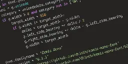
Seriously, though, Comic Sans was originally designed to be legible at the smallest possible font size, and the lack of hard lines makes it easier to read!
My original intention was to come here and proclaim that you're a heretic. Having looked at it for a moment, I think that you're onto something here...
This is cute~! I hated comic-sans when seeing it on lots of tacky corporate and school signs etc. but recently I ironically and then unironically fell in love with its whacky-ness, bold-ness and readability, (I use a Samsung phone, and used PT Mono on the S9, but then future phones blocked custom fonts, so I used one hack-ey Comic-Sans version since my mono ones are so underground no one developed a phone hack - now any font is possible again so I'm using the one below~ )
A few years ago my fav. font became PT Mono, from Google Fonts - cyrilic compatible, it has these angular edges, and swoopy circle curves, so cute <3
THEN there was this font printed on 2011 Pentax Q cameras and lenses that I loved, and couldn't find the original, but there was something very similar, STALKER1 and related similar fonts
I run my real thoughts through a filter of chatgpt with instructions to make it work appropriate, edit font to comic sans, then vary the grayscale of each individual character before I send out emails to people I hate.
It's interesting that you added serifs and monospacing to a sans serif font. It's almost like comic sans but with all the things that make it comic sans removed.
I unironically really like Comic Mono despite not super being a fan of Comic Sans (not cos it looks bad, I think it's actually really nice looking, just overused)
I keep thinking about switching to this font. I use Fira Code atm, and I'd miss the ligatures, but this genuinely looks a a lot more readable
So despite the hate Comic Sans gets, squiggly fonts make it easier for dyslexics to read. Non-dyslexics can experience a similar effect by reading a book in serif then a non-serif font. I hate Comic Sans too lol but do what makes your life easier.
It's really weird to me how Internet sometimes decide to hate on things just for the sake of it.
I wouldn't be using it myself, because I'm not a fan of hand-written style fonts. But, I see no problem with Comic Sans.
I unironically love Comic Mono. I am not dyslexic, I have good eyesight, but I feel like I can read code so much more easily with it versus most other monospaced fonts.
There was a YouTube programmer I used to watch called funfunfunction. He'd do a weekly video where he'd take a task, a framework, and a "handicap". One episode I remember someone suggested "comic sans lol" , which he set up, but it looked good
Stumbled into this site while looking through other comments and apparently it was designed for the speech bubbles of a cartoon dog, not sure about the "legible at small sizes" claim - http://www.connare.com/whycomic.htm
the very typeface you’ve been trained to recognize since childhood
What does this mean? I feel like the one we learned from childhood would be Times New Roman since every teacher I had required that font.