What should be the community icon/banner*?
What should be the community icon/banner*?
THE VOTE HAS CONCLUDED LOBOTOMITES
Thanks to @rosahaj@lemmy.blahaj.zone, we have 3 choices for icons (custom ones can also be proposed too!)
Icons
#1: 
#2: 
#3: 
#4 :
#5: 
#6? Your choice, post it in the comments
Banners
#1: 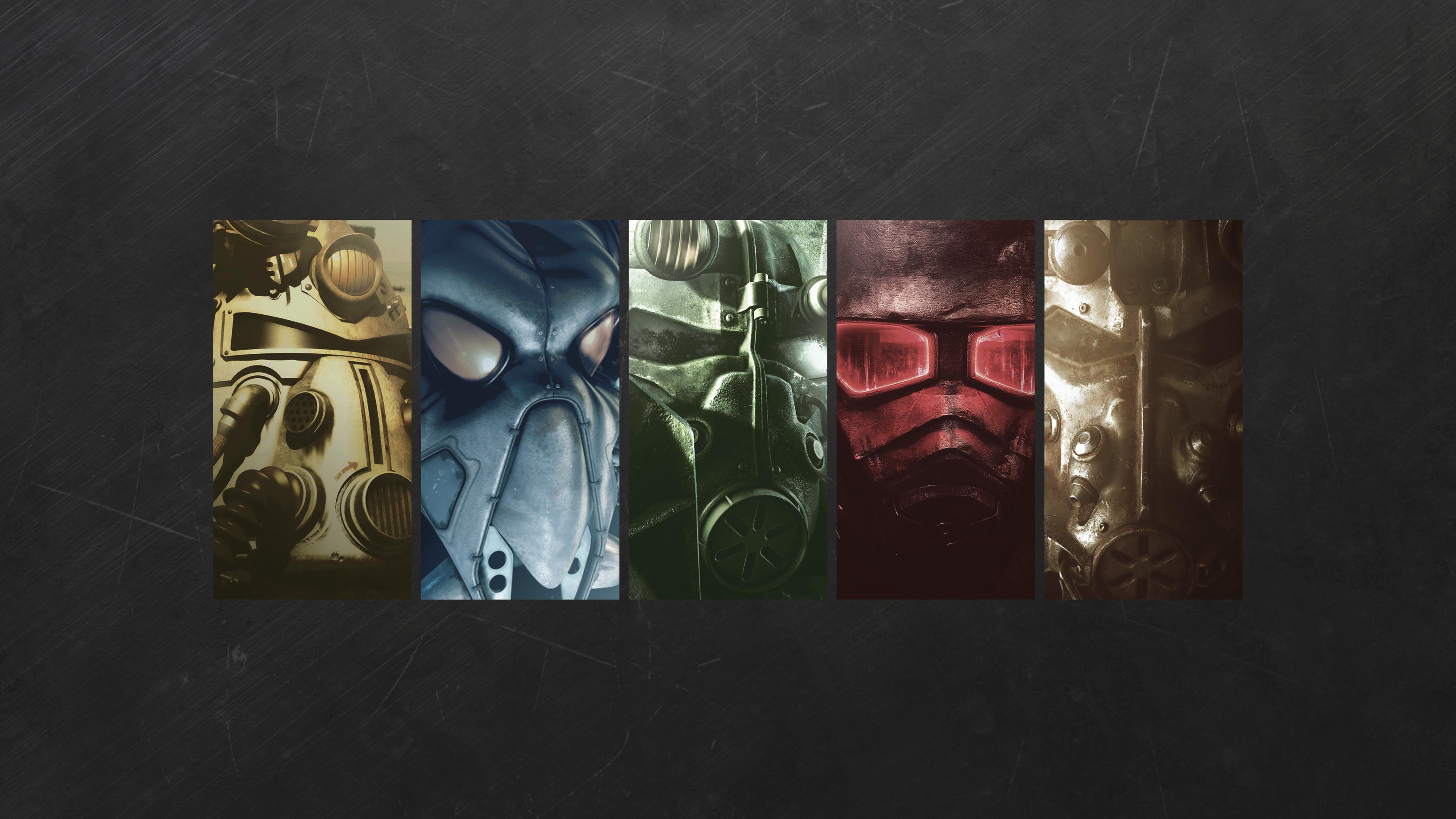
#2?: Same thing, post in comments
You're viewing a single thread.
(Outsider here)
Why not the same as 1, but with a blinking Lemmy logo like (2)?
new icon artist here! my reasoning is as follows:
- consistency (will use the same color scheme as c/falloutmods, the matrix space, and fallout.wiki)
- quality (the original is a rip of the fallout shelter icon, which means we dont have the source files to make edits/ higher quality versions)
- the winking is actually a really really good suggestion, I can definitely work that into new ones!
Oh I didn't mean editing the first icon. It could be remade from scratch.
I'll see if I can try doing it tonight
good luck! any participation is welcome :) lmk if u want any source files to make it with
Actually it was meant to be designed after ISO361 but it was too hard to make lmao. it would've actually looked as you described.
Personally i think they're both fine, but i get a more 4-76 feel from the vault icons, and a 1-3/nv from the radioactive symbol.
yeah this lol, I can send some demo pics of old iso-361 attempts when im at the machine i made em on