
You're viewing a single thread.
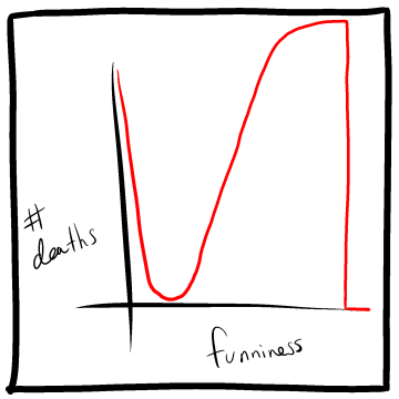
I think the labels on the axes of the bonus panel are flipped?
Must be, because multiple death tolls could have the same funniness but one death toll should not have multiple funninesses.
Why not?
For graph charts, dependent data goes on the y-axis; independent data on the x-axis.
Yeah but why can't a death count have two levels of funniness?
The chart should be somewhat descriptive in the correlation, and usually processing in intensity. The single death count having two different levels of funny isn't really explained by the chart, which isn't a real statistical analysis which might have odd data points like that, but instead is an extra joke.
As a joke, it doesn't portray itself well if the axies aren't swapped. When swapped, the joke is pretty obvious and understandable.
Agreed, doesn't make sense to me otherwise.
Maybe laughter really is the best medicine
"keep the funny going or everyone dies! no, slow it down, you're getting TOO funny!"